Jupyter Notebook の Rust カーネルでグラフや表形式を出力するのに若干手間取ったのでメモです。VS Code 上で実行しています。Rust のセルで rust-analyzer が使えないのが若干不便。
導入
Jupyter の Rust カーネルを導入。
$ cargo install evcxr_jupyter
$ evcxr_jupyter --install
Writing /home/hiromasa/.local/share/jupyter/kernels/rust/kernel.json
Writing /home/hiromasa/.local/share/jupyter/kernels/rust/logo-32x32.png
Writing /home/hiromasa/.local/share/jupyter/kernels/rust/logo-64x64.png
Writing /home/hiromasa/.local/share/jupyter/kernels/rust/logo-LICENSE.md
Writing /home/hiromasa/.local/share/jupyter/kernels/rust/kernel.js
Writing /home/hiromasa/.local/share/jupyter/kernels/rust/lint.js
Writing /home/hiromasa/.local/share/jupyter/kernels/rust/lint.css
Writing /home/hiromasa/.local/share/jupyter/kernels/rust/lint-LICENSE
Writing /home/hiromasa/.local/share/jupyter/kernels/rust/version.txt
Installation complete
依存関係の導入
Jupyter Notebook の Rust セルで以下のマジックコマンドを実行して描画系の依存ライブラリを導入。
:dep plotters = { version = "0.3.1", default_features = false, features = ["evcxr", "line_series", "point_series"] }
:dep statrs = "0.15.0"
:dep prettytable = { git = "https://github.com/phsym/prettytable-rs", package = "prettytable-rs", features = ["evcxr"] }
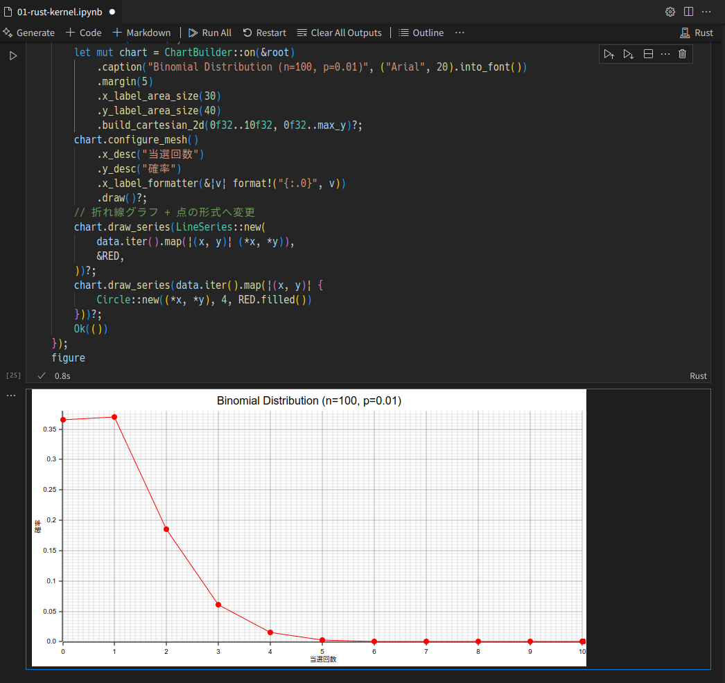
グラフを描画する例
plotters を使ってグラフを描画する例。evcxr_figure を使って Jupyter に返却すると画像がでる。
use statrs::distribution::{Binomial, Discrete};

let n = 100u64;
let p = 0.01;
let bin = Binomial::new(p, n).unwrap();
let data: Vec<(f32, f32)> = (0..=n).map(|x| (x as f32, bin.pmf(x) as f32)).collect();
let max_y = data.iter().map(|(_, y)| *y).fold(0f32, f32::max) + 0.01f32;
let figure = evcxr_figure((800, 400), |root| {
    root.fill(&WHITE)?;
    let mut chart = ChartBuilder::on(&root)
        .caption("Binomial Distribution (n=100, p=0.01)", ("Arial", 20).into_font())
        .margin(5)
        .x_label_area_size(30)
        .y_label_area_size(40)
        .build_cartesian_2d(0f32..10f32, 0f32..max_y)?;
    chart.configure_mesh()
        .x_desc("当選回数")
        .y_desc("確率")
        .x_label_formatter(&|v| format!("{:.0}", v))
        .draw()?;
    // 折れ線グラフ + 点の形式へ変更
    chart.draw_series(LineSeries::new(
        data.iter().map(|(x, y)| (*x, *y)),
        &RED,
    ))?;
    chart.draw_series(data.iter().map(|(x, y)| {
        Circle::new((*x, *y), 4, RED.filled())
    }))?;
    Ok(())
});
figure
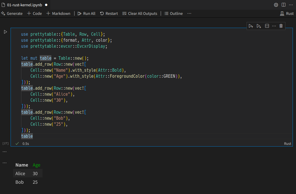
表敬式を出力する例
prettytable の Jupyter サポートを使って出力。
use prettytable::{Table, Row, Cell};
use prettytable::{format, Attr, color};
use prettytable::evcxr::EvcxrDisplay;

let mut table = Table::new();
table.add_row(Row::new(vec![
    Cell::new("Name").with_style(Attr::Bold),
    Cell::new("Age").with_style(Attr::ForegroundColor(color::GREEN)),
]));
table.add_row(Row::new(vec![
    Cell::new("Alice"),
    Cell::new("30"),
]));
table.add_row(Row::new(vec![
    Cell::new("Bob"),
    Cell::new("25"),
]));
table
表題と関係ないですが Python の例メモ
依存関係導入。
%pip install matplotlib
%pip install pandas
%pip install scipy
グラフと表敬式出力サンプル:
import numpy as np
import matplotlib.pyplot as plt
from scipy.stats import binom
import pandas as pd
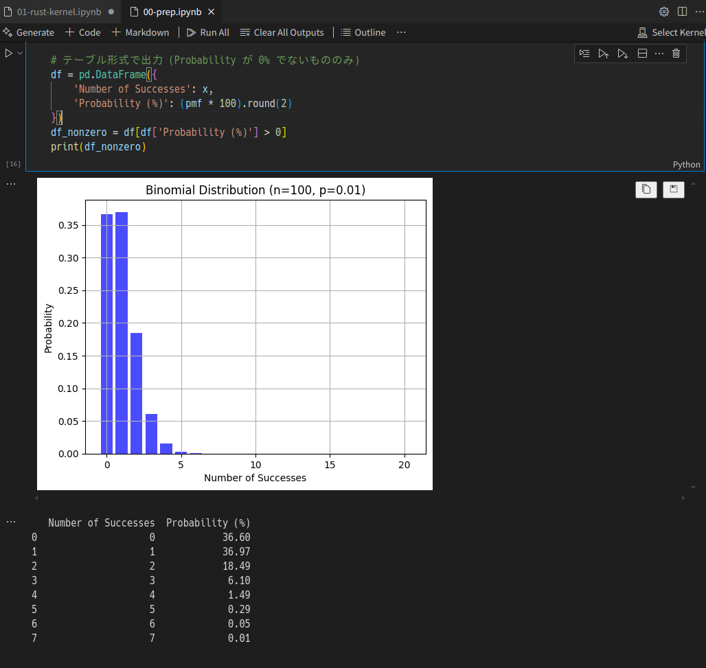
# パラメータ設定
n = 100 # 試行回数
p = 0.01 # 成功確率
# 二項分布の確率質量関数
x = np.arange(0, n + 1)
pmf = binom.pmf(x, n, p)
# グラフ描画
plt.bar(x[:21], pmf[:21], color='blue', alpha=0.7)
plt.title('Binomial Distribution (n=100, p=0.01)')
plt.xlabel('Number of Successes')
plt.ylabel('Probability')
plt.grid(True)
plt.show()
# テーブル形式で出力 (Probability が 0% でないもののみ)
df = pd.DataFrame({
'Number of Successes': x,
'Probability (%)': (pmf * 100).round(2)
})
df_nonzero = df[df['Probability (%)'] > 0]
print(df_nonzero)